After fitting a model to the data, how can you check the quality of the fit? This session delves into a variety of ways to examine your fits and check that the model is able to explain the data to a satisfactory level.
Key objectives:
- Learn how to plot the posterior model with the data
- Visualise goodness-of-fit without requiring the data to be re-binned
- Compare predicted model counts to observed counts to estimate goodness-of-fit
Exercise 2.1 - visualisation
Not everything needs to be a test. Visualisation can help check our model makes sense, that the fit worked and to infer information on the source being fit.- First, examine the corner and trace plots that BXA produces (located in
outputfiles_basename/plots/). What do these plots show? - Are there any parameter degeneracies? Why or why not?
- Next, save the spectral realisations corresponding to each row of the posterior into a pandas dataframe. This will enable us to plot the convolved posterior spectrum. If you want to plot the convolved posterior for Chandra and NuSTAR, you can pass the data group number to the
Plotcommands as e.g.,Plot.y(2).Xset.restore("%s/model.xcm" %(outputfiles_basename)) Plot("ldata") spec_df = pd.DataFrame(data = {"E_keV": Plot.x(1), "E_keV_err": Plot.xErr(1), "ldata": Plot.y(1), "ldata_err": Plot.yErr(1), "model_bestfit": Plot.model(1)}) for i, row in posterior_df.iterrows(): set_parameters(transformations=solver.transformations, values=row.values) Plot("ldata") spec_realisation = pd.DataFrame(data = {"m_%d" %(i): Plot.model(1)}) spec_df = pd.concat([spec_df, spec_realisation], axis=1) -
Plot 200 spectral realisations to show the posterior range of the convolved spectral fit.
for column in [c for c in df.columns if c.startswith("m_")][0:200]:
    ax.plot(df["E_keV"], df[column], c="k", alpha=0.05)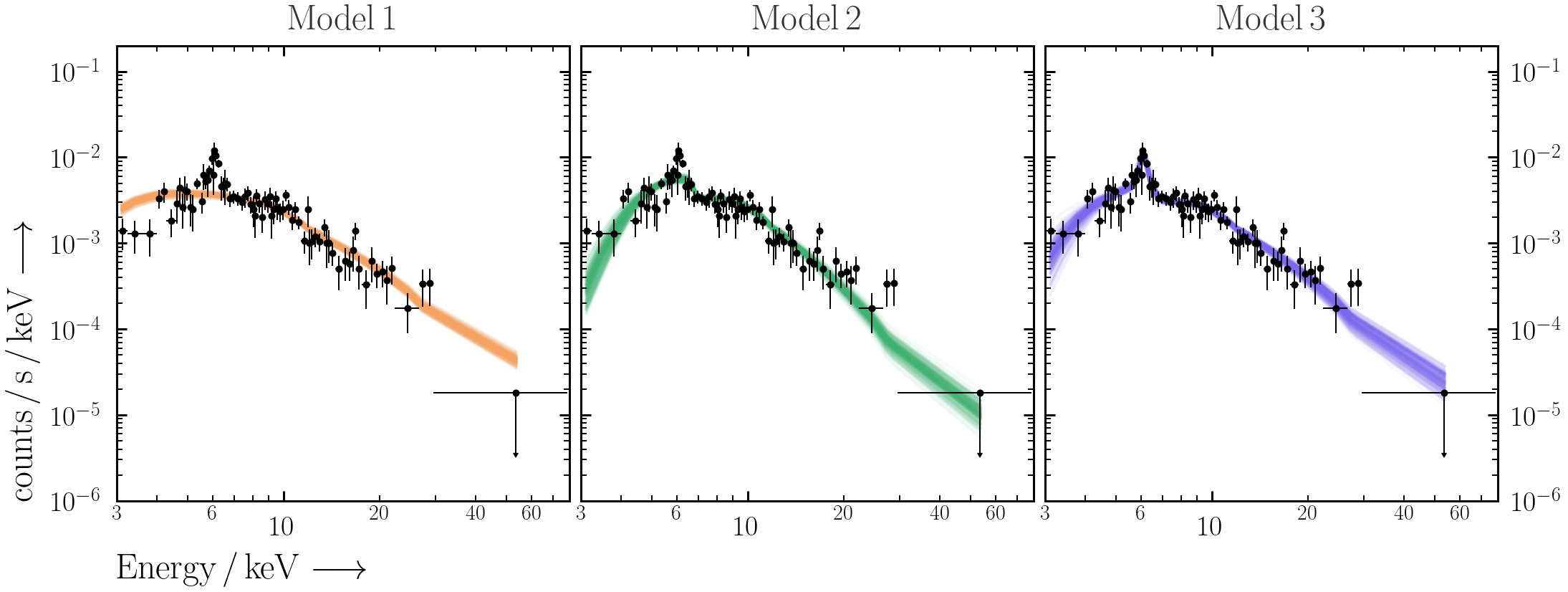
- Use
PredictionBandinultranest.plotto overplot the 68% unconvolved posterior spectral range with the data.from ultranest.plot import PredictionBand plt.sca(ax) band = PredictionBand(df["E_keV"].values) for i, column in enumerate([c for c in df.columns if c.startswith("m_")][0:200]): band.add(df[column].values) band.shade(q=0.34)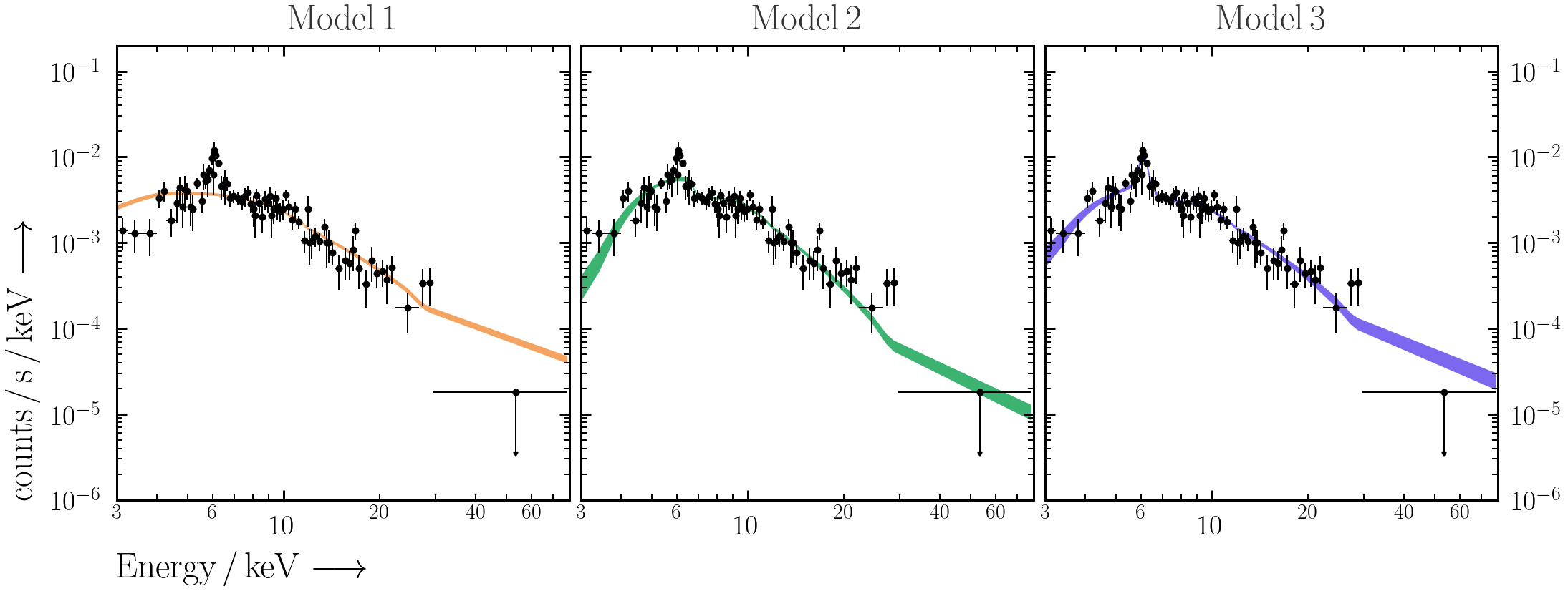
- Does the model do a good job of explaining the data? Why or why not?
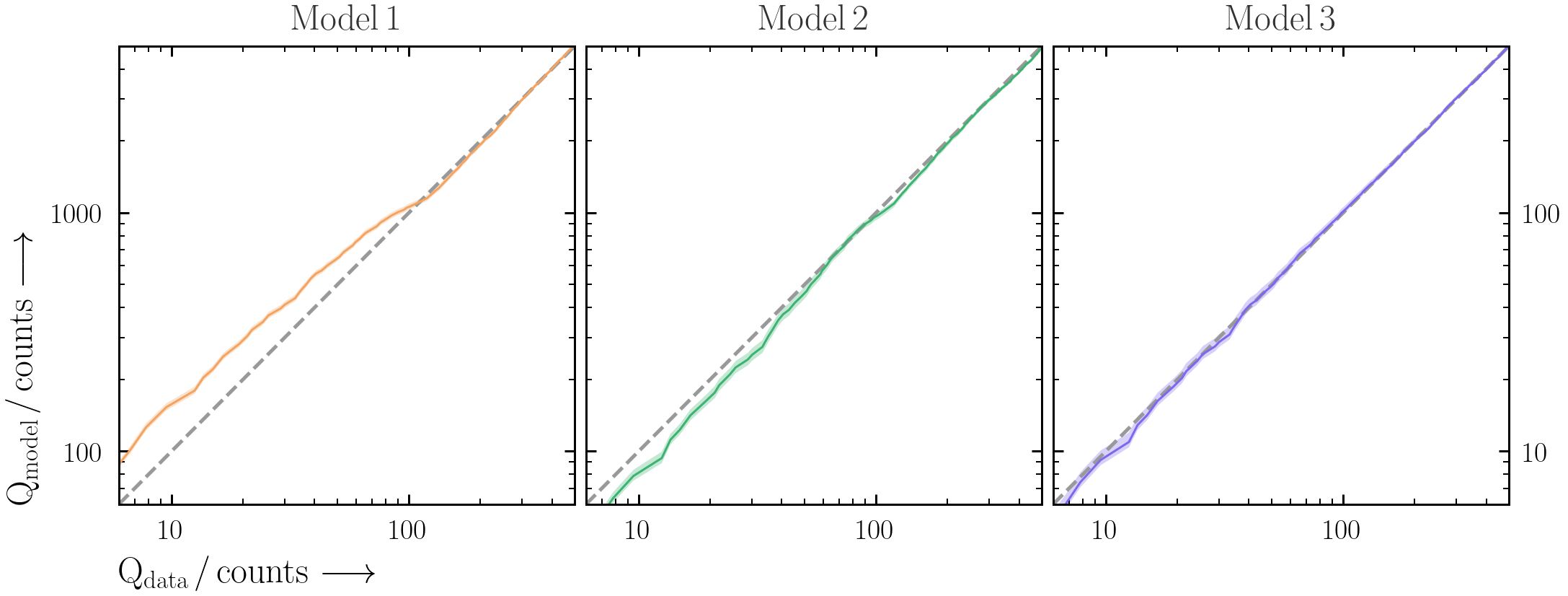
A useful way to visualise the plot is with Quantile-Quantile (Q-Q) plots -- i.e. the cumulative observed counts vs. the cumulative predicted model counts. The benefit of using cumulative counts is that the data does not need to be binned more than it already has been.- First produce the Q-Q plot for the BXA-derived best-fit spectral model for
model1. Make sure to plot the total detected counts on both axes.- PyXspec:
Xset.restore("%s/model.xcm" %(outputfiles_basename))
Plot.background = True
Plot("lcounts")
src_counts = np.array(Plot.y(1)) * 2. * np.array(Plot.xErr(1))
bkg_counts = np.array(Plot.backgroundVals(1)) * 2. * np.array(Plot.xErr(1))
mod_counts = np.array(Plot.model(1)) * 2. * np.array(Plot.xErr(1))
Qdata = np.cumsum(src_counts + bkg_counts)
Qmodel = np.cumsum(mod_counts + bkg_counts)
- PyXspec:
- The best-fit model is only part of the story. By saving the individual cumulative model realisations (similar to Exercise 2.1), plot a Q-Q plot for
model1with the total posterior model ranges included.- PyXspec:
Xset.restore("%s/model.xcm" %(outputfiles_basename))
Plot.background = True
Plot("lcounts")
src_counts = np.array(Plot.y(1)) * 2. * np.array(Plot.xErr(1))
bkg_counts = np.array(Plot.backgroundVals(1)) * 2. * np.array(Plot.xErr(1))
qq_df = pd.DataFrame(data = {"E_keV": Plot.x(1), "E_keV_err": Plot.xErr(1), "src_counts": src_counts, "bkg_counts": bkg_counts})
for i, row in posterior_df.iterrows():
    set_parameters(transformations=solver.transformations, values=row.values)
    Plot("lcounts")
    mod_counts = np.array(Plot.model(1)) * 2. * np.array(Plot.xErr(1))
    qq_realisation = pd.DataFrame(data = {"mod_counts_%d" %(i): mod_counts})
    qq_df = pd.concat([qq_df, qq_realisation], axis=1)
- PyXspec:
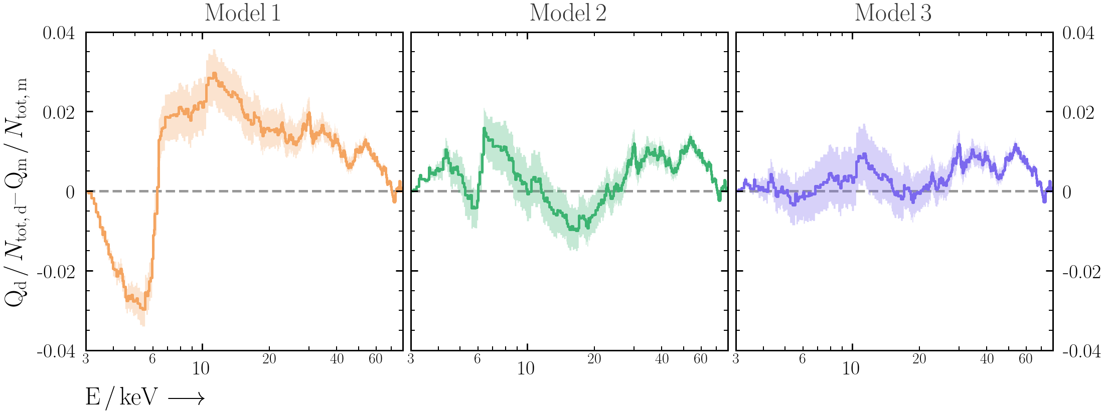
- It can be difficult to interpret the deviations from the 1:1 line by eye in Q-Q plots. As an alternative, plot the different between cumulative data and cumulative model counts against energy. Do all the models explain the data in a satisfactory way? Why or why not?
- Repeat the above exercises for
model2andmodel3.
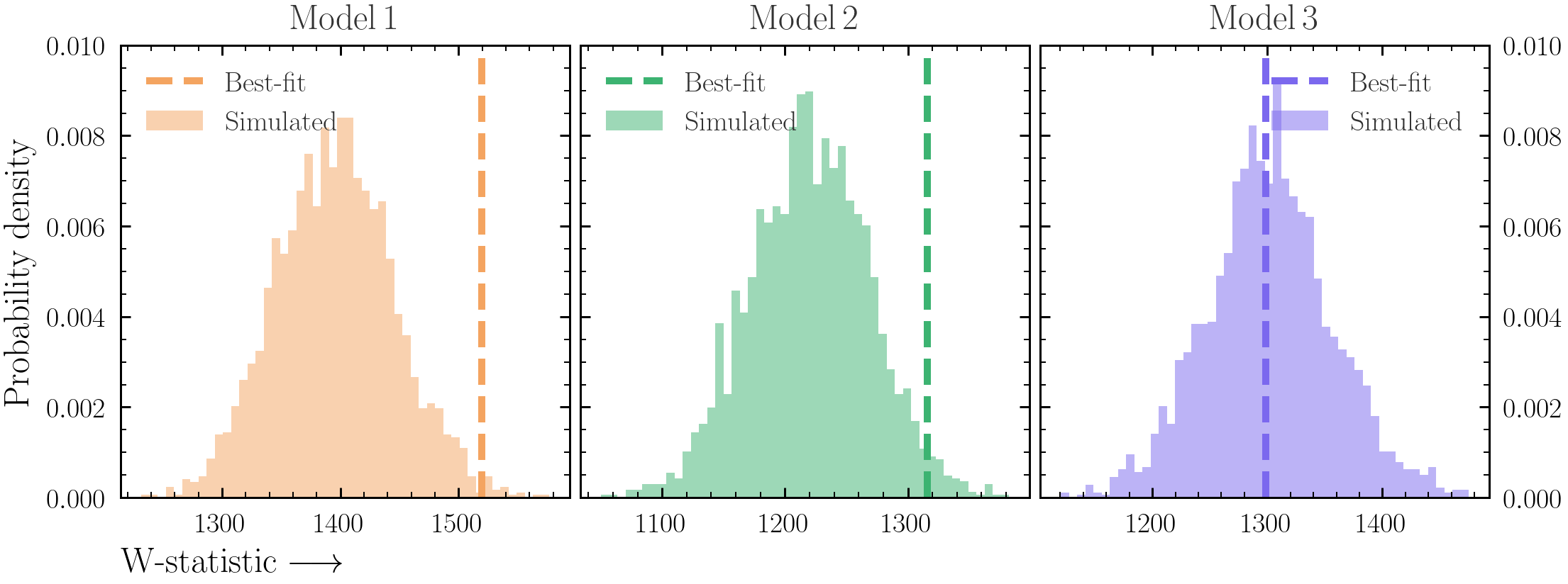
Exercise 2.3 - posterior predictive checks
The model fit will never be perfect. But at what level are deviations from a perfect fit significant?- For
model1, load the best-fit model and simulate a new spectrum from it. See Exercise 0.5 for information about simulating a spectrum. - Repeat the simulation process for a large number of simulations, and save the fit statistic on each iteration. You can use a few different posterior rows also to ensure the scatter is realistic.
- PyXspec:
fitstat = Fit.statistic
- PyXspec:
- Plot the distribution of fit statistics together with the fit statistic from the best-fit.
- Now instead of just saving the fit statistic on each iteration, save the data required for the Q-Q plot (i.e. source, background and model counts as well as energy).
- Plot the Q-Q and Q-Q-difference plots as in Exercise 2.2, but include the posterior range that you have generated with simulations.
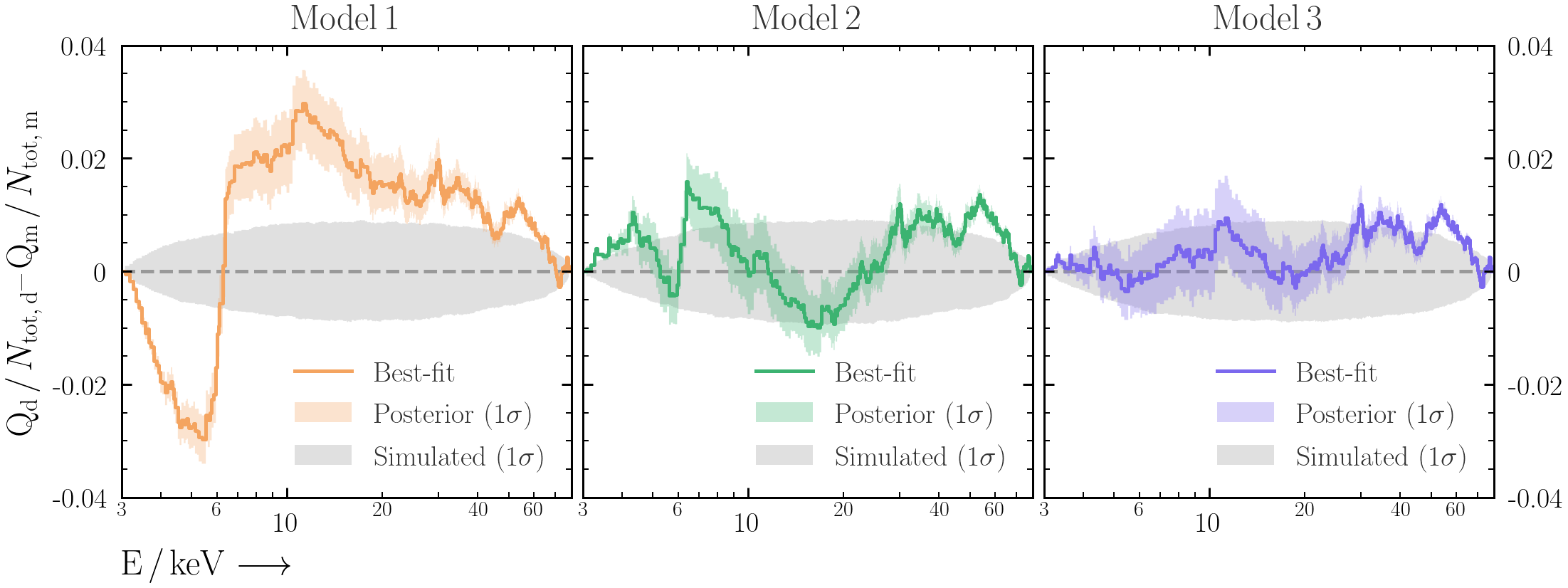
- Repeat this process for
model2andmodel3. What can you say about the deviations from a perfect fit for each model?
- Use